My mam and I both have Hetty and Henry vaccuum cleaners. Hetty has been part of my life for three or so years and when mam needed to buy a new hoover, I had no hesitation in recommending the Numac family to her.
I noticed that everytime my mam went to turn off her Henry, that she hit the "hi power" button instead of the on/off switch.
This puzzled me. I never got this wrong. We investigated...
On my cleaner, the on/off switch is green and the hi-power switch is red - this must be the intuitive colour for operation.
Which one would you go for to switch it on/off?
Another example... I remember getting a new bank card and noticing that almost everytime I used it, I inserted it at the wrong end... whereas, this had never happened with my previous card.
Unfortunately I can't remember exactly which end I inserted first, but I think it was blue!
The History of Design - I didn't know when I set out what would be discussed here. I was always proud to say I was studying "The History of Design" at the National College of Art and Design (NCAD) in Dublin... so that was my starting point...
HeadImage

Thursday 30 July 2015
Thursday 16 July 2015
Back to first principles
I call this method with which I approach life "back to first principles" without being entirely certain that that term is correct. I remember learning about first principles in maths class in secondary school and a lightbulb flickering on inside my head.
Here's a story to illustrate my meaning...
A new washing machine is delivered and needs to be installed. The old machine had both a hot and cold water input whereas the new machine only has one water input.
The installer rummages through the bits and pieces of plumbing attachments... he can't find what he's looking for. He wants to close off one of the inputs, to cap it. Something like this:
But WHY?! Why add to the detritus? This is the first step in a scenario that could develop into this...
So I suggested "going back to first principles". Remove the excessive y-junction and replace with a more simple piece of plumbing - a straight joint. Simpler than the cap with all the potential problems it can bring.
The installer was full of praise. Dumbstruck in the simplicity of the solution. Surprised by the "out of the box" thinking. And it seemed so obvious to me. More than obvious, it seemed the better solution.
Friday 27 March 2015
Spice Rack
For years, I've been needing a proper spicerack. And today, I got delivery of one which I bought on ebay.
It's wonderful to have all the spices standing on a custom-made shelf.
So simple but so hard to find. I'm delighted I finally bit the bullet and made this purchase. Well-packaged, simply made: ian5088
Looking at that picture, my next requirement will be a carrot storage area! And something for all the bottles to :) but just imagine what the place was like before the spice rack arrived!!!
Monday 23 February 2015
Travel emotions
As a designer, I find it really inspiring to travel. To see places. How people live and "do things". Objects, routines, etc which we take for granted at home can be presented differently abroad.
I'm in France - this is my second trip this year. In January I was in the village of Availles-Limousin, an hour from Poitiers. And now I'm in Sospel, about an hour from Nice. I'm really digging these rural French towns - with one or two bakeries, a butcher, a weekly market!
On both these recent travel occasions, I noticed the same emotions cropping up. And I tried to document them:
In days leading up to today - a little restless perhaps but busy and glad to have a definite deadline to work towards and around. Wondering if it was necessary to go, what the point was, why.
At home, on the day of flying to Sospel, I'm excited and rearing to go. Tidying, cleaning, prepping, packing. Proud to be independent and able to go at a whim but also a little lonesome to have to undertake yet another journey-and change of environment-on my own. Last time I was really scared about going, was it the change of scene? I conquered that this time by arranging a lift to the airport.
At the airport, same ol' same ol' - frustrations with baggage scanning routine, long walks to boarding gate, heavy hand luggage, noise noisy noise of announcements and bright pushy commercialism of shops.
Delighted at the restriction that travelling to somewhere requires - limitations of what to bring, activities that can be done - liking that!
And in the airport upon arrival, trepidation at what lies on the other side of the automatic doorway past the "Anything to Declare" area. And relief that this is a civilized European country and bombardment by hawkers and eager taxi men is not de rigeur - recollections of India and even New York.
On the train to Sospel, it's all to easy. Train announcements are so standard and predictable, no matter what language. There's a familiar routine to follow, common everywhere. Travel isn't challenging in modern societies. I could be anywhere! Wondering why I am - why amn't I just at home if it's all so samey. And disappointed that I don't have a satisfactory answer to that question. Keep moving. The train takes off - change. There's a sameness but it's different.
Friday 12 December 2014
Natural Dyes
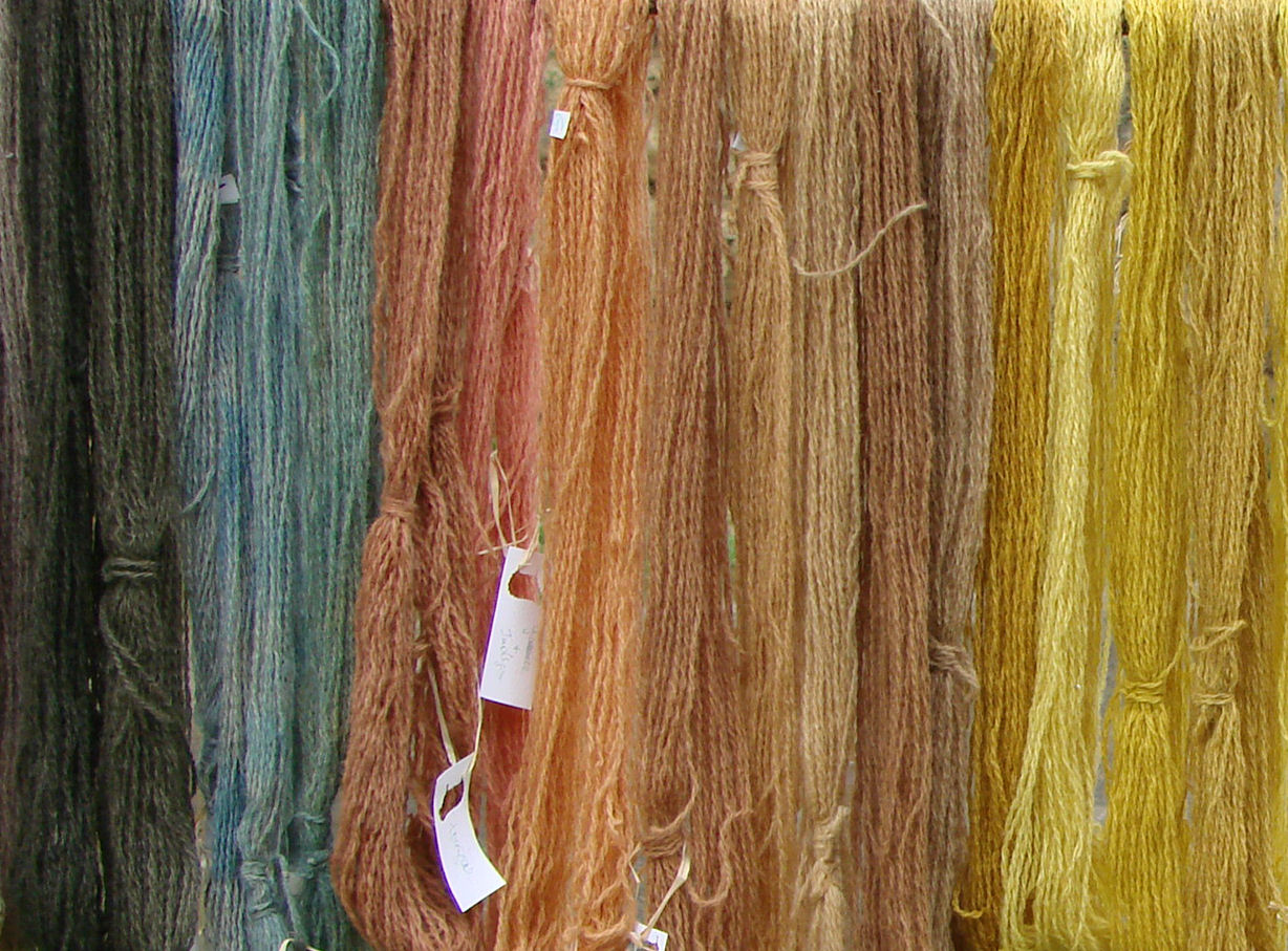
I visited The National Folklore Collection (NFC) yesterday and was privileged to view the contents of a beautiful wooden box. The box contained wool samples. Each sample of wool had been dyed naturally. The name on the presentation boards is Evelyn Lyndsay. Staff at the NFC said they thought Lillias Mitchell had bequeathed the box who, they thought, was her niece. I should go back and look at all the records for accurate information.
Dyes from the Kitchen Green / Ashburner
The Use of Vegetable Dyes Thurston
A Modern Herbal Mrs Greene
Wild Flowers in Colour Penguin
Tree Recognition John Kilbracken
The Observer's Book of Lichens K Alvin
Spinning and Dyeing Dalby / Christmas
12h - Blackberry - root - oxalic acid
13a - Black Crottle - Parrnelia omphalodes - lichen [lovely deep brown]
15b&c - Bracken - fronds - b:chrome; c: alum + iron
26c - Leavers - Galium aparine - roots
65a - Lady's bedstraws - Galium vernum - roots - alum
87c - Red Cabbage - leaves - chrome [blue colour]
109d - Weld -Reseda luteola - whole plant - alum + iron
1a - Apple - Pyrus malus - bark
2a - Ash - Fraxinus excelsior - bark
8a - Barberry - Berberis spp. - inner bark
9a - Beetroot - Beta vulgaris - root [yellow]
12c - Blackberry - Rubus fruiticosus - frozen fruit [brown]
13a - Black Crottle - Parrnelia omphalodes - lichen [lovely deep brown]
16a - Buddleia globosa - flowers
27a - Coffee - Coffea arabica - grounds
30a - Crottle - Parmelia Saxatilis - lichen
44a - Flowering Crab Apple - Malus - bark
58a - Horsechestnut - Aesculus hippocastanum - nuts
71a - Mahonia Japonica - inner bark
76a - Onion - Allium cepa spp. - skins
87a - Red Cabbage - Brassica oleracea - leaves [blue]
92a - Rhubarb - Rheum rhaponticum -leaves
92f - Rhubarb - Rheum rhaponticum - root
99a - Sea Ivory
103a - Tea
110a - Wild Iris
114d - Yew - wood chip
115a - Coal - ash
115d - Coal - dust
116a - Soot
147a - Rose - Rosa spp. - roots
159a - Waterlily - roots
164a - Eucalyptus - root
Mordants
- Alum
- Chrome
- Iron
- Tin
- Cream of Tartar - tartaric acid
- Oxalic acid
- Soda - bicarbonate of soda
- Vinegar - weak acetic acid
- Ammonia
Non-poisonous plants needing no mordant
(To use with young children)- ash twigs
- beetroot
- blackberries
- horsechestnuts
- onion skins
- pine cones
- red cabbage leaves
- tea leaves
Suggested books
A Dyer's Manual Jill GoodwinDyes from the Kitchen Green / Ashburner
The Use of Vegetable Dyes Thurston
A Modern Herbal Mrs Greene
Wild Flowers in Colour Penguin
Tree Recognition John Kilbracken
The Observer's Book of Lichens K Alvin
Spinning and Dyeing Dalby / Christmas
Interesting colours
The numbers are the referrencing system used on the display board, I type them here for ease of finding them again next time I'm in and to keep my notes all together.12h - Blackberry - root - oxalic acid
13a - Black Crottle - Parrnelia omphalodes - lichen [lovely deep brown]
15b&c - Bracken - fronds - b:chrome; c: alum + iron
26c - Leavers - Galium aparine - roots
65a - Lady's bedstraws - Galium vernum - roots - alum
87c - Red Cabbage - leaves - chrome [blue colour]
109d - Weld -Reseda luteola - whole plant - alum + iron
No Mordant:
Without doubt, the deeper coloured yarns are from dyes which use another substance ("mordant") as well as the plant substance; I suppose I only discovered this when I compiled this list and looked at the colours.1a - Apple - Pyrus malus - bark
2a - Ash - Fraxinus excelsior - bark
8a - Barberry - Berberis spp. - inner bark
9a - Beetroot - Beta vulgaris - root [yellow]
12c - Blackberry - Rubus fruiticosus - frozen fruit [brown]
13a - Black Crottle - Parrnelia omphalodes - lichen [lovely deep brown]
16a - Buddleia globosa - flowers
27a - Coffee - Coffea arabica - grounds
30a - Crottle - Parmelia Saxatilis - lichen
44a - Flowering Crab Apple - Malus - bark
58a - Horsechestnut - Aesculus hippocastanum - nuts
71a - Mahonia Japonica - inner bark
76a - Onion - Allium cepa spp. - skins
87a - Red Cabbage - Brassica oleracea - leaves [blue]
92a - Rhubarb - Rheum rhaponticum -leaves
92f - Rhubarb - Rheum rhaponticum - root
99a - Sea Ivory
103a - Tea
110a - Wild Iris
115a - Coal - ash
115d - Coal - dust
116a - Soot
147a - Rose - Rosa spp. - roots
159a - Waterlily - roots
164a - Eucalyptus - root
Wednesday 30 October 2013
The Graphic Design of Signage
The research I should have done before transferring this post from my notebook to here
London underground schematic: How many colours/lines in original?An example where it was not appropriate... (look in transit maps of the world book)
An example of circles with numbers along route line
Example of brussels STIB timetable that makes sense.
Observations and frustrations
On a recent visit to Portugal, I ventured to the public bus stop at the airport to make my way to the city centre (and from there I was to travel to Vilamoura).The concrete area where taxis and buses left from displayed a two-sided pillar-board. Stray people would approach it and look at one side, then go around to look at the other side. Puzzled. One side of the pillar-like information board had a map on it; the other side had time tables. The trick was to make sense of the two together while not looking like an eejit dancing around the post.
The side with the schematic diagram used colours (how many colours / lines?) and a legend / key re route number with colour [the bus number could have been written in a circle along the line at regular intervals as is done...]
The side with the timetables used only the bus numbers, no colours (so you had to use the little legend to be able to cross-refer between timetable and schematic - and remember those two pieces of information are on different sides of the board/post).
Scale of the schematic map
When looking at the schematic map, it was hard to tell if it represented a city, a region, a country or the outskirts of a city etc. For example, I wanted to travel to Vilamoura, others wanted to travel to other holiday destinations in the region - the schematic didn't indicate how wide an area was served by this bus company.
Summer time / winter time
Although there were three bus-routes listed in the timetables, there were four timetables. There was winter or summer written on top of each. But actually, the option only applied to one bus. I think the bus number could have been repeated with the word summer/winter - it wasn't clear if the winter times referred to the equivalent route timetable above or below it. Maybe the spacing was wrong... Maybe... something was wrong.Timetable / Stops
The timetable didn't just give the time from the airport stop; in fact I'm not sure if it gave that time at all. Two or three destinations were listed and therefore it was difficult to match these with the schematic. Some destinations were listed twice. It wasn't clear what the start and end point of the bus-route was; or what point on the route we were at. What is the distance between stops and the time the journey will take? This was indicated with 7mins, 5mins etc in a vertical line alongside the destinations but I couldn't decipher it what with the circular route and the destination names appearing more than once. As far as I could make out, the bus was doing a circular route. I thought this because names of stops seemed repeated and there was an arrow by the side of the list of stops - a down vertical area but the list of stops ran over two columns - I don't know why - was the slip in the list arbitrary? A neat half/half of the names?Times on the timetable
The convention used for listing times was not appropriate. It was similar to the one used in Brussels which mostly works well. But when there is only one bus or less per hour, this method is daft!Alternative?
I wondered whether an electric sign that changes for winter/summer would be useful. But what do you do when an electric sign is misbehaving as was the case actually in the bus terminal in Faro city centre when I got there.When schematics work
The `London Underground' multi-coloured linear schema (originally designed by Harry Beck) works especially well for subways and undergrounds because it is mapping *underground* which needn't correspond with the layout of streets and access point to the stop/station are limited in number and location.Destination
I did get there! A bus came, I asked the driver... that's how I got the information in the end!
Labels:
blogging,
graphic design,
knowlege-management,
Portugal
Monday 28 October 2013
Eileen Gray at IMMA
Visited the Eileen Gray exhibition at the Irish Museum of Modern Art (IMMA) in Dublin today. A perfect activity for a bank holiday monday - and we weren't alone in thinking that, a government minster and a radio broadcaster also visited the museum at the same time!
We claim Eileen Gray as one of our greatest Irish architect/design/artists. But she spent her working life in France. The houses she had built are on the Côte d'Azur. But of all the copies of letters, the video recordings, imagery etc, there wasn't any in French; we didn't get a feel for the francophile aspect of Eileen's life. Even though the exhibition is supported by the Centre Pompidou.
There are beautiful pieces on display, and personal letters to someone called Pru (I never did find out who she was or what their relationship was), and articles by contemporaries praising Ms Gray's works and ideas. Le Corbusier makes an appearance. There is information about lacquering, the shop she had on Rue de Saint-Honoré in Paris and more.
Having studied architecture, I was familiar with her work and E-1027. I appreciate the effort of her design, the consideration put into finding solutions to particular problems in unique situations.
For example, a stunning dressing-cupboard. Used as a divider between the sleeping section of the room and another section (can't remember exactly).
There are shelves of different heights. Glass shelves. Wonderful hinged-drawers which swing out from one side. A full-length mirror. It's wonderful. All the more wonderful considering the precise location for which this object was designed. And the multiple functions it fulfills. The obvious functions which we can see in this exhibit - a dressing-table/cupboard; and the not-so-obvious which we can deduce from house plans and photographs - as room divider in a particular house interior.
And that's the problem I have with the exhibition overall. It's wonderful for a designer and trained architect like myself or to someone who is not coming to Eileen Gray for the first time, someone who reads plans and drawings, is familiar with the design scene of the age... but without that education this exhibition seems to be about objects of furniture, items without context, rug designs without rooms in which to put them or clients to own them.
Which is not what it's about for me. See this interior photograph - see the circular rug and circular pattern, that uncomfortable circular Michelin-man-esque chair, and the wall decoration with it's semi-circular arc. The objects are designed to be in this space. The chair is ok if it's uncomfortable - the room is a bedroom not a sitting room!
I'm disappointed. Nevertheless, the exhibition showed me some new sides to Eileen Gray - lamp designs and that interiors shop. She was great - but why was she great, oh curator, why?
Labels:
architecture,
Dublin,
EileenGray,
exhibition,
France,
Ireland,
museum
Subscribe to:
Posts (Atom)