HeadImage

HeadImage

Friday 12 December 2014

Natural Dyes

I visited The National Folklore Collection (NFC) yesterday and was privileged to view the contents of a beautiful wooden box. The box contained wool samples. Each sample of wool had been dyed naturally. The name on the presentation boards is Evelyn Lyndsay. Staff at the NFC said they thought Lillias Mitchell had bequeathed the box who, they thought, was her niece. I should go back and look at all the records for accurate information.

Mordants

  • Alum
  • Chrome
  • Iron
  • Tin
  • Cream of Tartar - tartaric acid
  • Oxalic acid
  • Soda - bicarbonate of soda
  • Vinegar - weak acetic acid
  • Ammonia

Non-poisonous plants needing no mordant

 (To use with young children)
  • ash twigs
  • beetroot
  • blackberries
  • horsechestnuts
  • onion skins
  • pine cones
  • red cabbage leaves
  • tea leaves

Suggested books

A Dyer's Manual Jill Goodwin
Dyes from the Kitchen Green / Ashburner
The Use of Vegetable Dyes Thurston
A Modern Herbal Mrs Greene
Wild Flowers in Colour Penguin
Tree Recognition John Kilbracken
The Observer's Book of Lichens K Alvin
Spinning and Dyeing Dalby / Christmas
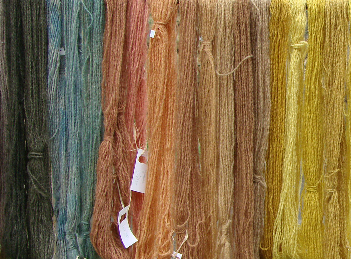
Interesting colours

The numbers are the referrencing system used on the display board, I type them here for ease of finding them again next time I'm in and to keep my notes all together.
12h - Blackberry - root - oxalic acid
13a - Black Crottle - Parrnelia omphalodes - lichen [lovely deep brown]
15b&c - Bracken - fronds - b:chrome; c: alum + iron

26c - Leavers - Galium aparine - roots
65a - Lady's bedstraws - Galium vernum - roots - alum
87c - Red Cabbage - leaves - chrome [blue colour]
109d - Weld -Reseda luteola - whole plant - alum + iron

No Mordant:

Without doubt, the deeper coloured yarns are from dyes which use another substance ("mordant") as well as the plant substance; I suppose I only discovered this when I compiled this list and looked at the colours. 
1a - Apple - Pyrus malus - bark 
2a - Ash - Fraxinus excelsior - bark
8a - Barberry - Berberis spp. - inner bark
9a - Beetroot - Beta vulgaris - root [yellow]
12c - Blackberry - Rubus fruiticosus - frozen fruit [brown]
13a - Black Crottle - Parrnelia omphalodes - lichen [lovely deep brown]
16a - Buddleia globosa - flowers
27a - Coffee - Coffea arabica - grounds
30a - Crottle - Parmelia Saxatilis - lichen
44a - Flowering Crab Apple - Malus - bark
58a - Horsechestnut - Aesculus hippocastanum - nuts
71a - Mahonia Japonica - inner bark
76a - Onion - Allium cepa spp. - skins
87a - Red Cabbage - Brassica oleracea - leaves [blue]
92a - Rhubarb - Rheum rhaponticum -leaves
92f - Rhubarb - Rheum rhaponticum - root
99a - Sea Ivory
103a - Tea
110a - Wild Iris
114d - Yew - wood chip
115a - Coal - ash
115d - Coal - dust
116a - Soot
147a - Rose - Rosa spp. - roots
159a - Waterlily - roots
164a - Eucalyptus - root

Wednesday 30 October 2013

The Graphic Design of Signage

The research I should have done before transferring this post from my notebook to here

London underground schematic: How many colours/lines in original?
An example where it was not appropriate... (look in transit maps of the world book)
An example of circles with numbers along route line
Example of brussels STIB timetable that makes sense.

Observations and frustrations

On a recent visit to Portugal, I ventured to the public bus stop at the airport to make my way to the city centre (and from there I was to travel to Vilamoura).
The concrete area where taxis and buses left from displayed a two-sided pillar-board. Stray people would approach it and look at one side, then go around to look at the other side. Puzzled. One side of the pillar-like information board had a map on it; the other side had time tables. The trick was to make sense of the two together while not looking like an eejit dancing around the post.
The side with the schematic diagram used colours (how many colours / lines?) and a legend / key re route number with colour [the bus number could have been written in a circle along the line at regular intervals as is done...]
The side with the timetables used only the bus numbers, no colours (so you had to use the little legend to be able to cross-refer between timetable and schematic - and remember those two pieces of information are on different sides of the board/post).

Scale of the schematic map

When looking at the schematic map, it was hard to tell if it represented a city, a region, a country or the outskirts of a city etc. For example, I wanted to travel to Vilamoura, others wanted to travel to other holiday destinations in the region - the schematic didn't indicate how wide an area was served by this bus company.

Summer time / winter time 

Although there were three bus-routes listed in the timetables, there were four timetables. There was winter or summer written on top of each. But actually, the option only applied to one bus. I think the bus number could have been repeated with the word summer/winter - it wasn't clear if  the winter times referred to the equivalent route timetable above or below it. Maybe the spacing was wrong... Maybe... something was wrong.

Timetable / Stops

The timetable didn't just give the time from the airport stop; in fact I'm not sure if it gave that time at all. Two or three destinations were listed and therefore it was difficult to match these with the schematic. Some destinations were listed twice. It wasn't clear what the start and end point of the bus-route was; or what point on the route we were at. What is the distance between stops and the time the journey will take? This was indicated with 7mins, 5mins etc in a vertical line alongside the destinations but I couldn't decipher it what with the circular route and the destination names appearing more than once. As far as I could make out, the bus was doing a circular route. I thought this because names of stops seemed repeated and there was an arrow by the side of the list of stops - a down vertical area but the list of stops ran over two columns - I don't know why - was the slip in the list arbitrary? A neat half/half of the names?

Times on the timetable

The convention used for listing times was not appropriate. It was similar to the one used in Brussels which mostly works well. But when there is only one bus or less per hour, this method is daft!

Alternative?

I wondered whether an electric sign that changes for winter/summer would be useful. But what do you do when an electric sign is misbehaving as was the case actually in the bus terminal in Faro city centre when I got there.

When schematics work

The `London Underground' multi-coloured linear schema (originally designed by Harry Beck) works especially well for subways and undergrounds because it is mapping *underground* which needn't correspond with the layout of streets and access point to the stop/station are limited in number and location.

Destination

I did get there! A bus came, I asked the driver... that's how I got the information in the end!

Monday 28 October 2013

Eileen Gray at IMMA

Visited the Eileen Gray exhibition at the Irish Museum of Modern Art (IMMA) in Dublin today. A perfect activity for a bank holiday monday - and we weren't alone in thinking that, a government minster and a radio broadcaster also visited the museum at the same time!
We claim Eileen Gray as one of our greatest Irish architect/design/artists. But she spent her working life in France. The houses she had built are on the Côte d'Azur. But of all the copies of letters, the video recordings, imagery etc, there wasn't any in French; we didn't get a feel for the francophile aspect of Eileen's life. Even though the exhibition is supported by the Centre Pompidou.
There are beautiful pieces on display, and personal letters to someone called Pru (I never did find out who she was or what their relationship was), and articles by contemporaries praising Ms Gray's works and ideas. Le Corbusier makes an appearance. There is information about lacquering, the shop she had on Rue de Saint-Honoré in Paris and more.
Having studied architecture, I was familiar with her work and E-1027. I appreciate the effort of her design, the consideration put into finding solutions to particular problems in unique situations.
For example, a stunning dressing-cupboard. Used as a divider between the sleeping section of the room and another section (can't remember exactly).
There are shelves of different heights. Glass shelves. Wonderful hinged-drawers which swing out from one side. A full-length mirror. It's wonderful. All the more wonderful considering the precise location for which this object was designed. And the multiple functions it fulfills. The obvious functions which we can see in this exhibit - a dressing-table/cupboard; and the not-so-obvious which we can deduce from house plans and photographs - as room divider in a particular house interior.
And that's the problem I have with the exhibition overall. It's wonderful for a designer and trained architect like myself or to someone who is not coming to Eileen Gray for the first time, someone who reads plans and drawings, is familiar with the design scene of the age... but without that education this exhibition seems to be about objects of furniture, items without context, rug designs without rooms in which to put them or clients to own them.
Which is not what it's about for me. See this interior photograph - see the circular rug and circular pattern, that uncomfortable circular Michelin-man-esque chair, and the wall decoration with it's semi-circular arc. The objects are designed to be in this space. The chair is ok if it's uncomfortable - the room is a bedroom not a sitting room!
I'm disappointed. Nevertheless, the exhibition showed me some new sides to Eileen Gray - lamp designs and that interiors shop. She was great - but why was she great, oh curator, why?

Saturday 12 October 2013

Costume exhibition in Kilkenny craft gallery

This exhibition runs until 16th October 2013:
http://www.nationalcraftgallery.ie/exhibitions/costume

There were two rooms; two displays.
 "Behind the Scenes"
Turning the traditional idea of a costume exhibition inside out, Behind the Scenes focuses on the undergarment, demonstrating that these complex, functional pieces are beautiful objects in their own right. It follows the team’s journey from initial concept through sketching, designing, pattern-cutting, sampling, construction and tailoring to the finished pieces themselves. Featuring panniers, hoops, crinolines and bustles, specially created for the exhibition by the Abbey team, the exhibition celebrates the sculptural qualities of these beautiful objects and the superb craft skills employed in making them.

Very interesting, good exhibition. Beautiful space in which to house the exhibition.
Although not entirely consistent in terms of the approach taken with each demonstrated piece, eg some had pic of item on-stage; some had notes of the play/character/actor who wore it, some had story to go with it (bird-seed bra; duvet crinoline), some had notes on or interview with the designer. I'm being fussy but it's because the information that was there was so excellent that I would have liked similar for each item on display! The exhibition information boards needed a little more thought on the layout, or a bit of planning or... as I said, being fussy.
There was really great information and the story of the underwear garment provided alongside the fat man suit. Unfortunately for me, I'd heard all the stories on a radio programme so the surprises and highlights of this small exhibition were already known to me.
Setting out on my career as costume designer, I'm starting to draft my own patterns. Corsetry is something that fascinates me, I'm a little daunted by it.
These pattern pieces were labelled "Corset pattern pieces" - I was puzzled, how did they fit together?! On closer inspection, the pieces were labelled with different designer/character/actress names. It looks cool on the wall as it's laid out with the shadows behind the pieces, but ultimately there is no deeper layer of information provided.
***
"Future Fashion" was the second display and included pieces from:
Úna Burke
Andreia Chaves
Marloes ten Bhomer
Stephanie Bila
Ana Rajcevic
Julia Lundsten of FINSK
I'm in a "cage" phase at the moment so I particularly loved these Invisible Shoes.
Andreia Chaves is the creator; those works struck me above all and I sketched two of them: "Invisible Shoe 2" and "Goldsculpt 1".

Overall, a very worthwhile trip. Thank you -despite my pernickity comments - to curator Angela O'Kelly.

Monday 4 March 2013

Museum of Bags and Purses, Amsterdam

Didn't actually visit this museum, just popped in to the shop. Not sure what I thought. Potentially interesting exhibition on Schoolbags later this year.
Museum of bags and purses

Friday 11 May 2012

Church at Laytown

Recently I went for a walk by the sea at Laytown, Co. Meath.
And came across a church with a stunning window behind the altar that overlooked the sea with its waves and everchanging atmospheres.
I suspect the church may be designed by the architect, Liam McCormick, and think its name is Sacred Heart Church.
The old (19th Century?) facade is retained, a glass 'corridor' is placed behind it, entering into the modern ceiling-lit space. The front elevation clearly shows the old facade, with white angelic-like wings either side (the rounded 'body' of the new building) and sky visible in the upper openings where windows used to be.

Thursday 26 April 2012

The birth of a new blog

Over this past while, and especially these past few days, my interest in sewing has grown. It is fascinating - FASCINATING - to see the variety of blogs that are out there.
  • Some people blog to gather their own ideas together like a collage (which is what this Design blog has been for me, a collecting-point for my thoughts and little by little I can see my own style become recognisable)
  • Some people blog for support and to share their projects and ideas
  • Some people blog as a business - they promote their shop or their products
  • Some people blog to promote their ideas and way of life, to voice their opinions
One blogger, Adrienne, from All Style All Substance, is doing a thesis on feminine studies, and if I understand correctly the topic is sewing and women and the blogosphere.

I enjoy my Design History Musings very much. And I am still grappling with what "design" really is... or at least what it really is for me.

I don't want to confuse my sewing projects with my design musings. I want to partake in the sharing and commenting and admiring of the community of sewing bloggers! And my sewing projects don't need to be interrupted by postings about spoons!!!

There are many other online ways to gather together sewing enthusiasts. And by 'sewing' I really mean dressmaking because there are quilters and crafters out there and they're a whole other kettle of very interesting fish! Other tools include
  • burdastyle
  • flicker for photos
  • etsy or dawanda as an online shopping 'street' for retailers, consumers and window-shoppers all
  • pinterest (although I don't get the need to link to facebook or twitter)
  • facebook
  • twitter
  • patternreview
But for all that, I find blogs are leading the way.

My past few posts have been very wordy... that needs to come to an end too! More images, please.


I bought this postcard in the Museum in Ixelles in Brussels recently. I saw so much on my month in Europe that I haven't processed the half of it! I loved the postcard because the work is so concentrated and the pencil is touching the paper. He his Paul Hankar, an architect during the Art Nouveau style period. It is a poster drawn by Paul Crespin (1859-1944) and shows Hankar's concentration while doing the work and his body bent over the desk. I need my mind to give way to my hands and give way to physical production too.

I chose another two postcards while I was away; it strikes me now that they all have that theme of physicality and concentration on the task at hand.
This one is of a choral singer doing a solo line, or maybe she is a soloist and the other singers behind her provide backing... I'll never know! It resonated with me because I sing. I sing in a choir. And just before I left for Europe, I sang at the funeral of a good friend's grandfather. And I daresay I didn't look as composed  or as humble as this soloist does!
The image is a painting by Henry Lerolle (1848-1929) entitled À l'Orgue. I picked up the postcard in the Orangerie gallery in the Jardin des Tuilleries in Paris.
The next image could be haunting, but when you study the girl, she is just so concentrated and so immersed in reading the pages that the feeling changes to one of intrusion on her space. I imagine she's reading a script and about to go on stage. Or maybe she's directing the play or the film or... I don't quite know why I like it and I don't quite know why I can't help looking!
This postcard was bought in the Pompidou Centre in Paris. It is from an oil painting by Gerhard Richter (b. 1932) and is entitled Lesende.
I hope these three images are a satisfactory way to remind me of the purpose of this particular blog and to satisfactorily make the move to a dress-making only blog. Find it at fuail.blogspot.com