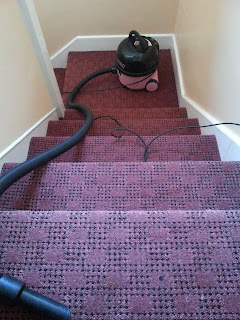
When I was hoovering my stairs recently, I took this photograph because I remembered a cartoon from a lecture in architecture school.
The cartoon showed a stairs and a hoover or vacuum cleaner which reached halfway and an exasperated housewife.
The question the lecturer posed was - which comes first - the length of the stairs or the length of the cable / hosepipe of the vacuum cleaner? Maybe the point he was trying to make is that architects can't be responsible for everything; the cart does come before the horse. Or maybe he was trying to suggest that a socket point halfway up a stairs wouldn't go amiss - if designers of electronic equipment can't be trusted then the architect should provide solutions for the domestic delight of housewives.
When I did a google search of "cartoon vacuum cleaner stairs", I didn't find the image I remembered but I did come across this ingenious solution!
A backpack vac.
The History of Design - I didn't know when I set out what would be discussed here. I was always proud to say I was studying "The History of Design" at the National College of Art and Design (NCAD) in Dublin... so that was my starting point...
HeadImage

Friday 27 January 2017
Friday 20 January 2017
Coffee cup waste bin
Spotted in DkIT college in Dundalk:
This bin is designed uniquely for the disposal of coffee cups. There are a number of round openings in the lid for coffee cups to go in and be stacked on top of one another. One of the round openings is for liquid disposal.
Friday 6 January 2017
Waste sorting in public places
Dublin Airport has got a new bin system.
There are three sections:
I'd like to think that such colours are innately understood but we're not there yet.
There are three sections:
- Paper and cardboard
- Plastic and cans (includes plastic bags!)
- General Waste
Colour
Each section is a different colour.- Blue for paper and cardboard (I think of blue for water, ie liquid, ie drinking, ie bottles)
- Green for plastic and cans (Green in my mind does not equal plastic or cans! Green is trees...!)
- Black for general waste (Yes, I think this colour makes sense).
I'd like to think that such colours are innately understood but we're not there yet.
Shape
The holes for each section are shaped differently- Rectangular for paper/cardboard (I think this is logical)
- Circular for plastic and cans (circular is the obvious shape for bottles and can and drinking vessels, however this bin takes all kinds of plastic - bags etc)
- Square for general waste
Size
All the bins are the same size; I wonder if they could be narrower or smaller or different heights?Design: a lot done, more to do
I am impressed but this is a protoype in my opinion.There are good design ideas but it's not quite there yet. I love that it is bilingual and I like the non-language-specific icons.
Subscribe to:
Comments (Atom)


