HeadImage

HeadImage
Showing posts with label architecture. Show all posts

Monday 7 August 2017

Paper Geodesic Dome

I used two sources when building my paper geodesic dome:
https://www.youtube.com/watch?v=Ym1388CcwuQ&t=176s
http://makezine.com/2008/02/29/how-to-make-a-geodesic-do/

The YouTube video inspired me to make a dome from paper and gave some tips on how and the diagrams on makezine were brill.

This is a 2V dome. That means there are two different strut lengths. I made them from yellow and white paper so I could see the pattern. One strut length is 88.3% the length of the other.


Tuesday 4 April 2017

Cloone co-op building

When I lived in Leitrim, this building was at the top of my road.
It was a pity it was empty and boarded up. Because I am sure it was a thriving place for community business.
Cooperatives were a big thing in Ireland, for farmers and maybe groceries too.

Thursday 4 August 2016

Earth architecture

Reading a book by Peter Frey,  Learning from Vernacular: Towards a New Vernacular Architecture,  I came across the phrase:
"Earth architecture represents a way of ecological construction that requires only 1% of the energy that is necessary to erect an equivalent building made of concrete or bricks,  and returning it to its original state requires no energy at all."
When I looked into constructing an earth (one of the options was cob) building as a vegetable storehouse,  I ran into problems with designing foundations.  So the first miscomprehension with the above sentence would be believing that the *entire* building can reduce energy so dramatically.  Typically there is some stone,  brick or concrete construction required too. Secondly,  are we not calculating human labour involved? Because gathering the earth required is laborious -  it should be subsoil with less organic matter than topsoil so deeper digging required! Return to its original state... don't mistake this as implying that the building will leave no mark or footprint when gone- remember those foundations?  And the roofing will likely not be earthen either.

Thursday 27 August 2015

Insighting, Ideating, Iterating

I took this section from http://knowledge.insead.edu/blog/insead-blog/the-innovative-organisation-learning-from-design-firms-3833
It describes for me so clearly the design process and the way I was taught in architecture school although nobody ever defined the stages like this.
User-centric insighting: In order to create value in novel ways (the goal of innovating), you must first locate opportunities to do so. Where to start looking is easy to see—with the end-user—but it’s far more difficult to detect and synthesise actionable information within the complexity of the user experience. Customer surveys and focus groups simplify the process, but are often removed from how people authentically respond in the marketplace. Designers, by contrast, prefer observation to interrogation, developing empathy to discern unarticulated, even unconscious, user needs. As Tim Kobe, CEO of design firm Eight, Inc. put it, “We represent the end-user in all the design decisions that take place in these innovation projects.” And that’s why building empathy with the target user is crucial, as Continuum did when working with Procter & Gamble to reinvigorate the Pampers brand. Observing mums and their babies, designers realised that the mothers’ ultimate concern was their infant’s development, not the diaper itself. With that in mind, they devised a line of premium diapers for different developmental stages (Swaddlers, Cruisers, etc.) rather than segmenting by age.

Deep and diverse ideating: Designers generate heaps of new ideas based on user insights. This phase is where they unleash their creativity, coming up with as many and as distinct potential solutions as possible before putting much thought into implementation. These preliminary solutions are the product of an organisational process that deliberately cultivates a broad range of perspectives. Far from avoiding eccentric and exceptional voices, design firms seek them out and encourage their contributions within an atmosphere of freedom of thought and playfulness. Playfulness is so important at IDEO that they have created a Toy Lab where designers conceive and test out some of their creations by playing with kids as young as 18 months.

Rapid and cheap iterating: Designers understand that the creative flurry of the ideation phase can take them only so far. They are quick to make ideas concrete and not shy to declare them failures when they don’t live up to expectations. For designers, failures are not negative events but learning experiences. Producing fast and cheap dummy versions to test out concepts means that even when the experiments flop, it’s still a win-win. Singapore-based multidisciplinary design consultancy Awaken Group makes “low-resolution prototypes” of spaces using stacked cardboard boxes to represent walls. That way, alterations can be made to the design in a matter of moments as the client walks through the demo space.

Thank you to Manuel Sosa. Read more at http://knowledge.insead.edu/blog/insead-blog/the-innovative-organisation-learning-from-design-firms-3833#IubtlgXCQALWBUiK.99

Monday 28 October 2013

Eileen Gray at IMMA

Visited the Eileen Gray exhibition at the Irish Museum of Modern Art (IMMA) in Dublin today. A perfect activity for a bank holiday monday - and we weren't alone in thinking that, a government minster and a radio broadcaster also visited the museum at the same time!
We claim Eileen Gray as one of our greatest Irish architect/design/artists. But she spent her working life in France. The houses she had built are on the Côte d'Azur. But of all the copies of letters, the video recordings, imagery etc, there wasn't any in French; we didn't get a feel for the francophile aspect of Eileen's life. Even though the exhibition is supported by the Centre Pompidou.
There are beautiful pieces on display, and personal letters to someone called Pru (I never did find out who she was or what their relationship was), and articles by contemporaries praising Ms Gray's works and ideas. Le Corbusier makes an appearance. There is information about lacquering, the shop she had on Rue de Saint-Honoré in Paris and more.
Having studied architecture, I was familiar with her work and E-1027. I appreciate the effort of her design, the consideration put into finding solutions to particular problems in unique situations.
For example, a stunning dressing-cupboard. Used as a divider between the sleeping section of the room and another section (can't remember exactly).
There are shelves of different heights. Glass shelves. Wonderful hinged-drawers which swing out from one side. A full-length mirror. It's wonderful. All the more wonderful considering the precise location for which this object was designed. And the multiple functions it fulfills. The obvious functions which we can see in this exhibit - a dressing-table/cupboard; and the not-so-obvious which we can deduce from house plans and photographs - as room divider in a particular house interior.
And that's the problem I have with the exhibition overall. It's wonderful for a designer and trained architect like myself or to someone who is not coming to Eileen Gray for the first time, someone who reads plans and drawings, is familiar with the design scene of the age... but without that education this exhibition seems to be about objects of furniture, items without context, rug designs without rooms in which to put them or clients to own them.
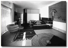
Which is not what it's about for me. See this interior photograph - see the circular rug and circular pattern, that uncomfortable circular Michelin-man-esque chair, and the wall decoration with it's semi-circular arc. The objects are designed to be in this space. The chair is ok if it's uncomfortable - the room is a bedroom not a sitting room!
I'm disappointed. Nevertheless, the exhibition showed me some new sides to Eileen Gray - lamp designs and that interiors shop. She was great - but why was she great, oh curator, why?

Friday 11 May 2012

Church at Laytown

Recently I went for a walk by the sea at Laytown, Co. Meath.
And came across a church with a stunning window behind the altar that overlooked the sea with its waves and everchanging atmospheres.
I suspect the church may be designed by the architect, Liam McCormick, and think its name is Sacred Heart Church.
The old (19th Century?) facade is retained, a glass 'corridor' is placed behind it, entering into the modern ceiling-lit space. The front elevation clearly shows the old facade, with white angelic-like wings either side (the rounded 'body' of the new building) and sky visible in the upper openings where windows used to be.

Monday 26 April 2010

What's the best direction for sleep?

I did a search for the above sentence a few week's ago and came up with the most nonsensical answers; an array of reasons and justifications and dismissals for sleeping N-S, E-W or not. The explanations ranged from sleeping in the direction of the rising sun, magnetic energies and much more besides.

But there was no conclusive argument that I could find.

The reason I'm bothered recalling any of this, is that I'm in a very contented, relaxed, happy mood at the moment. And I'm putting it down to sleep. And the biggest change in my life regarding sleep is the position of my bed. Because - I will confess - I did experiment with positioning my bed different ways.Now the problem I had to contend with was that the house isn't facing due anywhich way!!!

I chose E-W after consulting Spiro Kostof's History of Architecture. Churches are constructed on an East-West axis.

Friday 16 April 2010

The Bridge in Ireland inspired by a Harp

I've always been quite cynical about the idea that the Calatrava bridge at Macken Street was inspired by a harp. How fitting?! How handy! The harp is a native symbol of Ireland. Strings are cables. And curved steel can imitate curved carved wood.
Santiago Calatrava has designed other bridges in similar style:
  • Serreria Bridge in Valenica, Spain
  • Footbridge Puerto Mujer, Buenos Aires, Argentina
  • Light Rail Train Bridge, Jerusalem, Israel
  • Katehaki Bridge, Athens, Greece
  • Sundial Bridge at Turtle Bay, California, USA
  • an early design for the Alamillo Bridge, Seville, Spain
But today, listening to Morning Ireland on Radio One, I was alerted to Love:Live Music day. One of the many free performances involved 12 harpists, strewn across the bridge playing music.
When I arrived at lunchtime today (thankfully) there was no strew-ing. On the south-side, there was a cluster of harpists strumming Carolan tunes harmoniously. And I thought (I love Carolan's music) that perhaps this connection might not be a bad thing... and might possibly, I conceded, be intentional. Because the Beckett bridge does join the mast and the flat bridge at a particularly graceful angle and the steel given a particular design treatment at this point.
However, I am far from convinced - mostly because a harp on its side is a daft symbol!
Similarly, the bridge in Greece claims to be inspired by Athenian sailboats - perhaps part of the designer's charm is making these tenuous links between a generic, international bridge design and the native culture.I've tried rotating an image of the bridge and comparing it to a harp - the most noticeable difference/mismatch is that the strings on a harp run from the flat towards the top which is concave. If we are to look at the cables on the bridge running from the flat - they go towards a convex curve.
Too much analysis always spoils the fun so I'll finish by admiring the heavy steel at the base of the mast again - that shape and angle and mould and curve does bring a harp to mind.

Thursday 8 April 2010

Plastic brickwork

Isn't it horrible?? A little shed (public toilet?) being constructed in Howth I think.
I remember in India, the men sitting on the roadside shaping bricks and firing them.
And I remember learning about "specials" and "special-specials" in college.
Progress = plastic sheets with bricks drawn on. Sigh.

Saturday 27 March 2010

What a difference a... rooflight makes

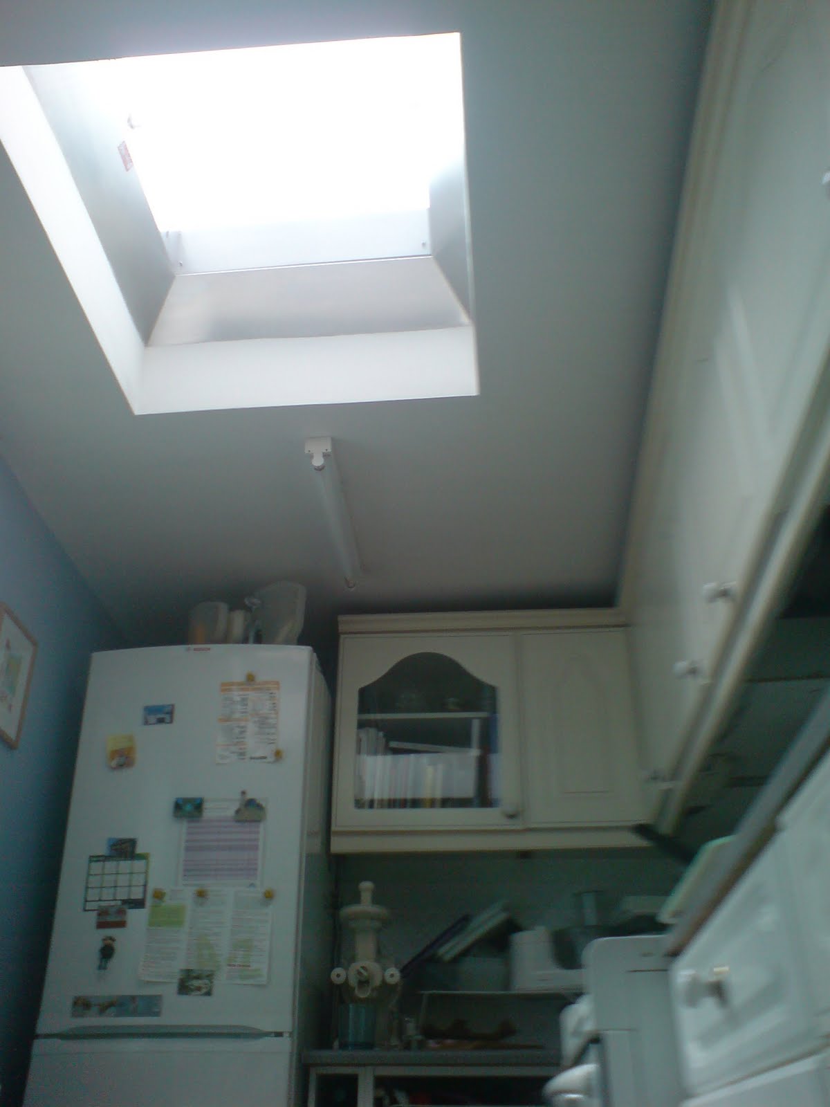
My aunt has a narrow galley kitchen.
Recently, a rooflight was added.
The room is flooded with light and seems wider and more spacious.

Thursday 14 May 2009

Calatrava's Dublin Bridge #2 arrives in Dublin

I missed it!! I was away for the weekend and not up to scratch on the goings-on in Dublin. The second of Calatrava's bridges arrived into the Liffey yesterday. It was sitting outside the East Link Bridge in Dublin port since Monday, waiting for ideal tidal and wind conditions.
Apparently, the opening of the East Link was only just wide enough to let the bridge (at a particular point) pass through and so the tide had to be at its highest point.
I wrote an article about the two bridge designs in Blianiris, an Irish language publication in 2004. It almost felt like a friend I hadn't seen in a while had returned again when I saw the bridge coming into the city on the news yesterday.
The bridge is moored in the Liffey and will be anchored in place in June. I mustn't miss that date!

Sunday 5 October 2008

Spaces and ground surfaces

The bluish colour of the above picture is awful, sorry about that. My phone was on funny settings when I took it. It's the plaza in front of AIB bank headquarters in Ballsbridge. They've done a beautiful job. I think it's a really nice space now.
There's something that just clicks when the correct ground surface is chosen. Another example is Collins' Barracks. I'm sure people don't even pay attention to the pale salmon finish there - it's the perfect surface. Subtle, unnoticeable and succeeding in placing the emphasis on the buildings surrounding the space.

Sunday 23 March 2008

Shape follows function

I read about the health benefits of eating baked potatoes recently and so decided I should invest in a potato scourer to scrub the potatoes well before cooking and eating. A problem often encountered with brushes etc at a kitchen sink is how to distinguish the functions or uses of the different brushes from each other - which brush is for scrubbing dirty saucepans, which to clean fingernails and which to scrub vegetables.
In a kitchen shop, I spotted this hideous little brush whose 'handle' was shaped like a potato. Usually I run a mile from this kind of 'pop' design. I remember lectures in college on the topic where pictures of buildings (mostly in America!) were shown: an American fried chicken diner in a building shaped like a large chicken. I think the disney buildings are examples of this style. And an architect who enjoyed the unashamed madness was Charles Moore, if I remember correctly. I'm sure I could dig out my lecture notes and look into this more.
At any rate, the idea that an object or building is easy to read or interpret because it is shaped like the thing it represents is daft. Just because this brush is shaped like a potato does not mean that someone will not scrub their fingernails with it. I can't vouch for that particular incident but definitely, I have had to stop myself picking up this brush when cleaning saucepans when no other brush is available.
Though I will admit the plastic half potato is very comfortable to hold.

Sunday 23 December 2007

An Ideal Hotel

Haven't blogged in ages and feel bad about it. New job - trying to settle down and such excuses.
Stayed in a hotel with my mam back in mid-November. We don't stay in hotels as a rule but I won a prize.
Got me to thinking about my ideal hotel room:
  • suitcase rack
  • place to hang/place used and therefore damp towels
  • underfloor heating in the bathroom
  • bedside reading lights that won't disturb the other person.

They seem basic enough requirements and I'm sure there's much more that could be listed there. It reminds me of a documentary I saw - an interview with the American architect, Philip Johnson filmed in his pavillion-like collection of buildings where he lived. The guest house was purposely missing things like light-switches positioned next to the bed and nice touches like that to intentionally annoy his guests and ensure they didn't overstay their welcome.

Friday 23 November 2007

Peig Sayers projected onto Bus Áras

This is a picture taken on my phone as I walked home past Bus Aras in Dublin a while ago.
It was a Wednesday evening. This image of Peig Sayers (an woman who lived on an island off the south coast and wrote a book about her travails that many students had to read in Irish class in school) was moving on the wall, winking at passers by, haunting the street.

TG4 were broadcasting the first tv show in the Paddywhackery series. Good publicity!I don't imagine Michael Scott foresaw this use of the blank wall!

Wednesday 17 October 2007

AAI Lecture

Only getting around to writing about this now. Randomly turned up at an Architectural Association of Ireland lecture in Trinity college on Thursday 11th. Eero Koivisto, a swedish architect gave a talk. He was amusing, had a good sense of humour.
He talked about many of his projects: converting a water tower to a house in Notting Hill, a design shop etc building in Japan, designs for the Italian company Cappellini: sofa with moving middle, and saucepan; an art exhibition space in Marfa, Texas (which is this town in middle America with thriving art community if I remember correctly), amongst others.
The auditorium was packed. It's fab how interested architects are in listening to each other and keeping up-to-date and it's not your civil-service do-a-course-during-work-hours - actually it probably is, cos it's not unusual for architects to still be at work well after the lecture finished at about 9!
Eero's parting words were what he views as vital for any practising architect or indeed designer:
  • Curiosity
  • Self-criticism
  • Passion
http://www.claesson-koivisto-rune.se/

Monday 8 October 2007

Corporate Express Website, Conservatories & Car Showrooms

The corporate express stationery website is fantastic (www.corporateexpress.ie). You can flick through the catalogue, page by page and zoom in and (if you're a member) see the price. It loads really quickly. It's great!

I was thinking about conservatories the other day. Visited Farmleigh house recently - it has a beautiful conservatory. With greenery and lovely wrought iron furniture. I was lucky enough to have afternoon tea there once; most enjoyable! And it got me to thinking how that contrasted with the modern idea of a "conservatory" that people tack onto their houses, to put bamboo furniture in them. I don't think the idea of a conservatory these days is for plants, which is what I imagine was the main purpose in houses contemporary to Farmleigh. A conservatory these days, as far as I can see, is a dumping ground, a place for drying clothes and a little used additional sitting room.

My third thought in this post is about building types. In college we learnt that the Stadium is one of the building types of our times. Though lesser in size, it came to me that another building type of our times is the Car Showroom. Large glass building often with a mezzanine office often built off a busy road. Kind of a modern conservatory only with air-conditioning

Wednesday 3 October 2007

HWCH

The Hard Working Class Heroes Festival took place in the Pod complex in Dublin last weekend. It's a 3-day affair to give unsigned bands a chance to perform in front of a wide audience, ideally consisting of people from the industry too. There were 6 rooms - in order of size: Working Man's Club, Lennon Lounge, Odeon, Pod, Crawdaddy, Tripod. The Odeon was for chilled out, sitting on comfy seats type music.
In terms of design:
  • the logo is pretty poor methinks. Indecipherable. No sense to the colour scheme.
  • the brochure and info was fine although the map was unhelpful. A rip-off from architect's drawings without considering how they would be useful to patrons.
  • The layout of the rooms, the one-way system, the signage was well thought-out. (Apart from access to the Odeon being via the street and therefore not being able to bring drinks.)
Here's my scribbles on the bands I saw over the three nights. I did up my own timetable again so I could see where the overlaps in the schedule were.
Bands I enjoyed: Tribal District, Not Men But Giants, Le Bien. The attendance at most gigs was disappointing.

I met a friend who is in one of the bands and he had been busy throughout the day at mentoring sessions with PR people and others which he found very beneficial.Design, music, creativity - I suppose it's a valid posting for this blog! And I did try and involve the idea of "designing a festival". Another example that I was at was the Dun Laoghaire Festival of World Cultures. It's interesting the info that is handed out to the public, the way the thing is laid out etc. I think it's related to Design!

Thursday 20 September 2007

Urban Sprawl

Dublin City Council and the Institute of Public Administration hosted a conference in Croke Park Conference Centre on Successful Apartment Living - Combating Urban Sprawl.

The speakers were:
Tom Collins, Maynooth University (chair)
Paddy Bourke, Lord Mayor of Dublin
John Gormley, Green Party, Minister for the Environment, Heritage & Local Government
Frank McDonald, Irish Times
Dr. Jane Gray, Social Sciences, Maynooth University
Henk van der Kamp, School of Spatial Planning, Dublin Institute of Technology
John Tierney, City Manager, Dublin City Council
John Bowman, RTÉ (chair)
Lars Fränne, Stockholm City Council, Sweden
Alex Ely, mæ architects
Hubert Fitzpatrick, Irish Homebuilders Association
Daithí Doolan, Sinn Féin councillor, chair of Strategic Policy Committee (SPC) dealing with planning
Mary Murphy, Labour councillor, chair of Housing, Social & Community Affairs SPC

There were about 220 people present and there were contributions from the floor from other Dublin City Councillors and the RIAI president, James Pike, amongst others.

I was extremely impressed with John Tierney and Alex Ely. I think John has great vision and ideas for leading the city of Dublin. Unfortunately, Alex spoke architecture-speak and I think it may have gone over the heads of a lot of the audience. He showed drawings of a scheme which displayed "permeability" and a variety of public-private spaces. A councillor in the audience commented that he was "in favour of gated housing schemes"! I think architects sometimes need to really explain drawings to clients/audiences. Point out the stairs on the street frontage where the resident enters their home and then can go out the back to the shared garden in contrast to a resident driving through a remote-controlled gate, to park their car in a shared space and scuttle in their own door. People without experience can't read all this from a drawing. There was also misunderstanding about high density=high rise. Alex argued it didn't, in fact density could drop with high-rise (I didn't take in the detail of this argument) but people weren't able to take this on board. I arrived home, to my one-and-half-storey on-street terraced city-centre house and it dawned on me that I am living in quite a high-density residential area myself. Look out my bedroom window at a tiny yard with bedroom extensions hanging off neighbouring houses. And there are 3 of us living in this 2-bed house so we're making good use of space. I should figure out the density in terms of floor area/footprint etc. I was also walking around the Peppercanister church area of the city and was amazed by the amount of mews houses and use that is made of laneways.

Departmental (D/EHLG) draft guidelines regarding minimum room sizes/ storage space etc were discussed a lot. And how they compared with the council's guidelines. Architects I spoke to afterwards claimed that the social housing they are designing is of a better standard, in terms of dimensions and thought, than those available on the market. Van der Kamp's talk was of the hierarchy of development plans (and guidelines). The order should be: national, regional, county, local; they lower ones adhere to those of a higher standing and are more specific.

Jane Gray has done research on people living in Ratoath, Leixlip, Mullingar and Lucan/Esker. She concluded they all like where they are living. And the commuter travelling from Mullingar-city centre Dublin isn't that extremely common.

Lars Fränne mentioned vacuuming-rubbish collection and how Sweden have abolished guidelines for minimum room dimensions etc.

Hubert Fitzpatrick gave the expected industry response regarding the financial loss homebuilders will make with the introduction of these new guidelines; apartments now have to be bigger. He also referred to the heating recommendations in the Building Regulations as if they were optimum and not absolute minimum. Worrying.

Frank McDonald related a nice story about growing up in the city centre and living there now. Pleasant.

As is proably usual with such conferences, there was very little conclusion.

Thursday 6 September 2007

Green Procurement / The Walmart Documentary

At a presentation in the Custom House entitled "The Carbon Footprint of the Public Service" I first heard about Green Procurement. It's just another aspect that purchasers need to take into account when assessing tenders received. And where does the idea of Green-ness start and finish? Green resources: natural and sustainable, green manufacturing, green transportation, green maintenance. It's a whole new checklist!
And on a similar vein, I've just watched "Walmart-The High Cost of Low Price" and it's put me off buying things in Penney's & Dunnes. buying clothes cheap means someone somewhere is suffering/ there is abuse. Does buying in second hand clothes shops count? Or making clothes? What about where the fabric is coming from?