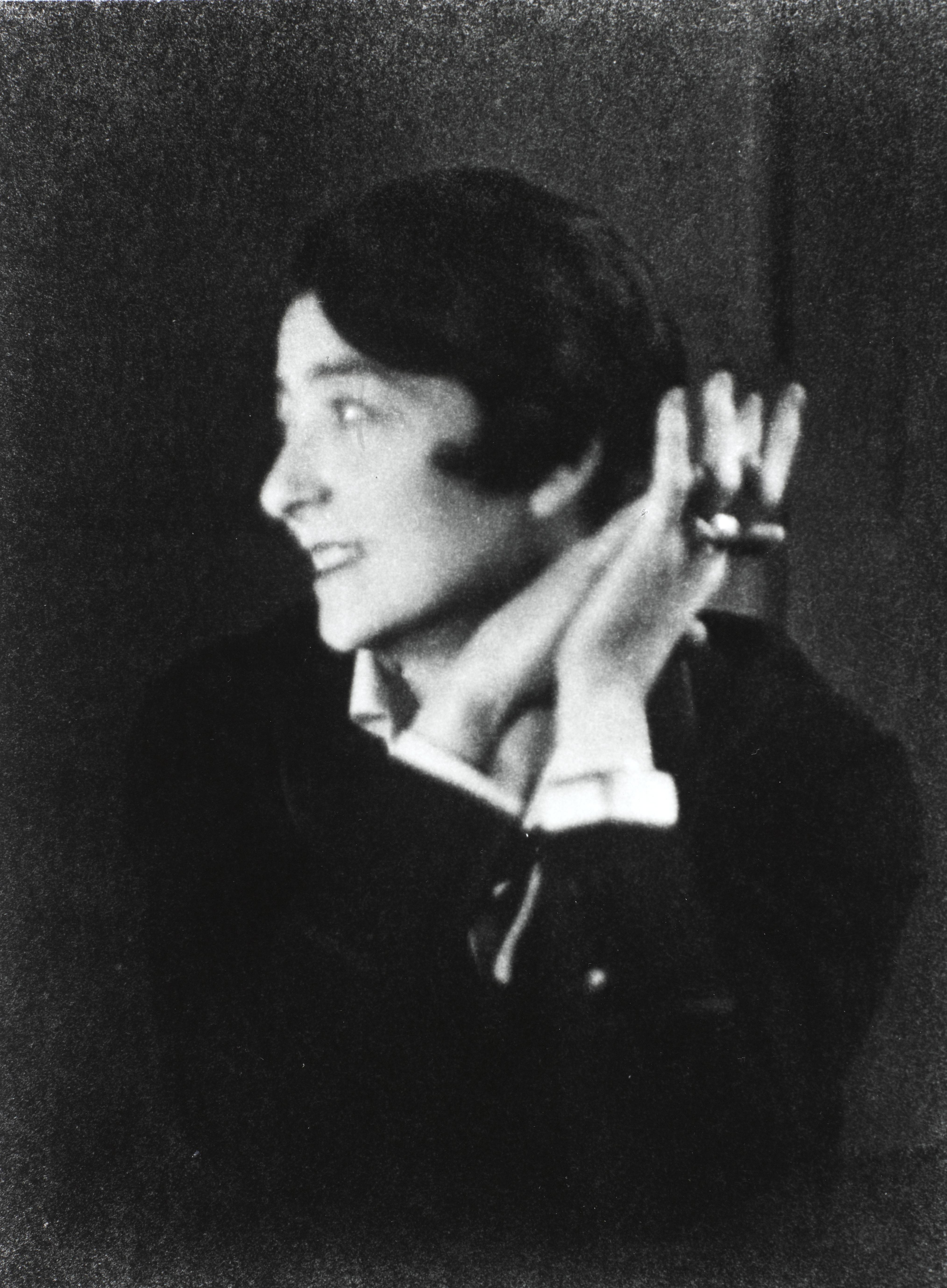
Visited the Eileen Gray exhibition at the Irish Museum of Modern Art (IMMA) in Dublin today. A perfect activity for a bank holiday monday - and we weren't alone in thinking that, a government minster and a radio broadcaster also visited the museum at the same time!
We claim Eileen Gray as one of our greatest Irish architect/design/artists. But she spent her working life in France. The houses she had built are on the Côte d'Azur. But of all the copies of letters, the video recordings, imagery etc, there wasn't any in French; we didn't get a feel for the francophile aspect of Eileen's life. Even though the exhibition is supported by the Centre Pompidou.
There are beautiful pieces on display, and personal letters to someone called Pru (I never did find out who she was or what their relationship was), and articles by contemporaries praising Ms Gray's works and ideas. Le Corbusier makes an appearance. There is information about lacquering, the shop she had on Rue de Saint-Honoré in Paris and more.
Having studied architecture, I was familiar with her work and E-1027. I appreciate the effort of her design, the consideration put into finding solutions to particular problems in unique situations.
For example, a stunning dressing-cupboard. Used as a divider between the sleeping section of the room and another section (can't remember exactly).
There are shelves of different heights. Glass shelves. Wonderful hinged-drawers which swing out from one side. A full-length mirror. It's wonderful. All the more wonderful considering the precise location for which this object was designed. And the multiple functions it fulfills. The obvious functions which we can see in this exhibit - a dressing-table/cupboard; and the not-so-obvious which we can deduce from house plans and photographs - as room divider in a particular house interior.
And that's the problem I have with the exhibition overall. It's wonderful for a designer and trained architect like myself or to someone who is not coming to Eileen Gray for the first time, someone who reads plans and drawings, is familiar with the design scene of the age... but without that education this exhibition seems to be about objects of furniture, items without context, rug designs without rooms in which to put them or clients to own them.
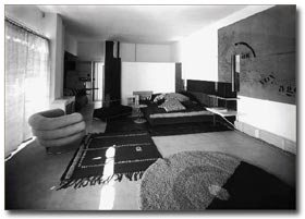
Which is not what it's about for me. See this interior photograph - see the circular rug and circular pattern, that uncomfortable circular Michelin-man-esque chair, and the wall decoration with it's semi-circular arc. The objects are designed to be in this space. The chair is ok if it's uncomfortable - the room is a bedroom not a sitting room!
I'm disappointed. Nevertheless, the exhibition showed me some new sides to Eileen Gray - lamp designs and that interiors shop. She was great - but why was she great, oh curator, why?
The History of Design - I didn't know when I set out what would be discussed here. I was always proud to say I was studying "The History of Design" at the National College of Art and Design (NCAD) in Dublin... so that was my starting point...
HeadImage
Showing posts with label exhibition. Show all posts
Monday 28 October 2013
Saturday 12 October 2013
Costume exhibition in Kilkenny craft gallery
This exhibition runs until 16th October 2013:
http://www.nationalcraftgallery.ie/exhibitions/costume
There were two rooms; two displays.
"Behind the Scenes"
Very interesting, good exhibition. Beautiful space in which to house the exhibition.
Although not entirely consistent in terms of the approach taken with each demonstrated piece, eg some had pic of item on-stage; some had notes of the play/character/actor who wore it, some had story to go with it (bird-seed bra; duvet crinoline), some had notes on or interview with the designer. I'm being fussy but it's because the information that was there was so excellent that I would have liked similar for each item on display! The exhibition information boards needed a little more thought on the layout, or a bit of planning or... as I said, being fussy.
There was really great information and the story of the underwear garment provided alongside the fat man suit. Unfortunately for me, I'd heard all the stories on a radio programme so the surprises and highlights of this small exhibition were already known to me.
Setting out on my career as costume designer, I'm starting to draft my own patterns. Corsetry is something that fascinates me, I'm a little daunted by it.
These pattern pieces were labelled "Corset pattern pieces" - I was puzzled, how did they fit together?! On closer inspection, the pieces were labelled with different designer/character/actress names. It looks cool on the wall as it's laid out with the shadows behind the pieces, but ultimately there is no deeper layer of information provided.
***
"Future Fashion" was the second display and included pieces from:
Úna Burke
Andreia Chaves
Marloes ten Bhomer
Stephanie Bila
Ana Rajcevic
Julia Lundsten of FINSK
I'm in a "cage" phase at the moment so I particularly loved these Invisible Shoes.
Andreia Chaves is the creator; those works struck me above all and I sketched two of them: "Invisible Shoe 2" and "Goldsculpt 1".
Overall, a very worthwhile trip. Thank you -despite my pernickity comments - to curator Angela O'Kelly.
http://www.nationalcraftgallery.ie/exhibitions/costume
There were two rooms; two displays.
"Behind the Scenes"
Turning the traditional idea of a costume exhibition inside out, Behind the Scenes focuses on the undergarment, demonstrating that these complex, functional pieces are beautiful objects in their own right. It follows the team’s journey from initial concept through sketching, designing, pattern-cutting, sampling, construction and tailoring to the finished pieces themselves. Featuring panniers, hoops, crinolines and bustles, specially created for the exhibition by the Abbey team, the exhibition celebrates the sculptural qualities of these beautiful objects and the superb craft skills employed in making them.
Very interesting, good exhibition. Beautiful space in which to house the exhibition.
Although not entirely consistent in terms of the approach taken with each demonstrated piece, eg some had pic of item on-stage; some had notes of the play/character/actor who wore it, some had story to go with it (bird-seed bra; duvet crinoline), some had notes on or interview with the designer. I'm being fussy but it's because the information that was there was so excellent that I would have liked similar for each item on display! The exhibition information boards needed a little more thought on the layout, or a bit of planning or... as I said, being fussy.
There was really great information and the story of the underwear garment provided alongside the fat man suit. Unfortunately for me, I'd heard all the stories on a radio programme so the surprises and highlights of this small exhibition were already known to me.
Setting out on my career as costume designer, I'm starting to draft my own patterns. Corsetry is something that fascinates me, I'm a little daunted by it.
These pattern pieces were labelled "Corset pattern pieces" - I was puzzled, how did they fit together?! On closer inspection, the pieces were labelled with different designer/character/actress names. It looks cool on the wall as it's laid out with the shadows behind the pieces, but ultimately there is no deeper layer of information provided.
***
"Future Fashion" was the second display and included pieces from:
Úna Burke
Andreia Chaves
Marloes ten Bhomer
Stephanie Bila
Ana Rajcevic
Julia Lundsten of FINSK
I'm in a "cage" phase at the moment so I particularly loved these Invisible Shoes.
Andreia Chaves is the creator; those works struck me above all and I sketched two of them: "Invisible Shoe 2" and "Goldsculpt 1".
Overall, a very worthwhile trip. Thank you -despite my pernickity comments - to curator Angela O'Kelly.
Tuesday 24 April 2012
Dirk Wynants
When I posted about the Visit to The Design Museum in Gent, I mentioned I'd write more about the exhibition about Dirk Wynants.
I loved this product:
I liked this product:
And I kind of liked this one:
I did not like this one: A kind of podium thing. Too "designery". Too "cool". A bare bulb? An overall unaesthetic shape. But I thought the internal step, the space for computer/notes to be hidden etc were good. Good ideas but badly manifested (in my opinion, of course, I think the Museum in Gent are very happy with it and they use it for launches and speeches).
But back to my very favourite of Dirk Wynants designs for the Extremis range: Arthur.
Arthur is a fold-up / flat-pack table that can be put together temporarily for a dinner party. Move the usual, regular, day-to-day bits of furniture and life aside, and fill the room with a table for friends and food. Everybody can have a large dinner party!
Comes in three different sizes for 8 or 10 or 12 people.
And the centre circular plate rotates (which I love and experienced in Cairo for eating mezze).
I loved this product:
I liked this product:
And I kind of liked this one:
I did not like this one: A kind of podium thing. Too "designery". Too "cool". A bare bulb? An overall unaesthetic shape. But I thought the internal step, the space for computer/notes to be hidden etc were good. Good ideas but badly manifested (in my opinion, of course, I think the Museum in Gent are very happy with it and they use it for launches and speeches).
But back to my very favourite of Dirk Wynants designs for the Extremis range: Arthur.
Arthur is a fold-up / flat-pack table that can be put together temporarily for a dinner party. Move the usual, regular, day-to-day bits of furniture and life aside, and fill the room with a table for friends and food. Everybody can have a large dinner party!
Comes in three different sizes for 8 or 10 or 12 people.
And the centre circular plate rotates (which I love and experienced in Cairo for eating mezze).
Monday 9 April 2012
Design Museum Gent
During a Month in Europe, I made a day-trip from Brussels to Gent.

Gent is a very picturesque city - quite Dutch with it's canals and bicylclists. It was very cold when we were there and not the most comfortable to walk around. We went to the Design Museum first but decided not grab lunch before heading in to the exhibitions. Nothing worse than an empty stomach + trying to take in what a museum has to offer (well ok, there are many many worse things...)
The guy at the desk was odd. He never gave us tickets although we paid, nor a map of the building. And pointed us in the direction of the cloakroom. We then entered into some period-style decorated rooms, a tour of which brought us back to the foyer and the ticket-man. Utterly confused, we wondered if we should cross the hallway and go through a passageway marked with a do-not-enter symbol. Perhaps the "do-not-enter-ness" applied if you hadn't yet bought your ticket...?!
We overheard a French couple being told the way... and on we went...
Much of the museum is housed in the rear building behind the courtyard. A modern insert behind an old facade. Apparently the floor is hydraulic and can be adjusted depending on the items being exhibited - a two-storey boat, I assume! Or a dinosaur...!
The permanent exhibition focusses very much on style - Art Nouveau, Rococco, Art Deco. This is not my own personal strong point. Historic referencing. Nor is it something I am interested in. Style and Period and School. Bah.
There were two temporary exhibitions which we visited: 'Design Works?' - a collection of the designed products by Dirk Wynants and 'Eternal Spring' - Barbara Nanning's glass sculptures.
We think, although it is not listed in the exhibition, and we somehow missed it on our walkabout in the galleries, that there was also an exhibition on Tablewear. Qui sait. As I said, this museum is not the easiest to manoevre about.
The Dirk Wynants exhibition started very bizarrely with an information board telling the story of how much globes meant to this person. No introduction about who the person is. I felt it was a marketing exercise for this designer. A chance to justify his designs and "explain" them. I think I will do a separate blog post about what I liked about his work and the pieces I liked.
Barbara Nanning's objects made me think that there is a distinction between creating or artistry and being a designer. I think "design" must define a separation between thinker and maker. The designer must communicate ideas through drawings or models or verbal instructions and someone else then produces the finished product as closely, hopefully, to the intentions and 'vision' of the designer. I think that is where the magic or the mystery occurs. In laying down the ideas, in describing them, and in their interpretation. There is a process of:
- client describes brief
- designer interprets brief and describes solution
- workmen produce solution
- client lives with the production
That process, I think now, is what fascinates me about "Design".
And not to confuse the issue too much, but always there is another element to the process:
- consumption
It also fascinates me that the client and their brief, for example "I need to buy a draining board rack", can be influenced by so many factors to do with marketing and shopping experience, and branding, and cost... whereas designers are influenced by creating a piece that is... what? dramatic? useful? etc... and how, in real life, do these needs collide?
To be continued....!!!
Oh - to conclude re the Design Museum in Gent. I saw some Lalique glass. A vase. And am fascinated to see more of his work.
I think Design Museums are tricky. Are they aimed at the general public? At designers? At creating awareness of "design" - etc. I think of the museum in London which Terence Conran was involved with and the wonderful museum in New York.
Labels:
design,
exhibition,
Gent,
glass,
museum,
production-consumption
Friday 16 April 2010
The Bridge in Ireland inspired by a Harp
I've always been quite cynical about the idea that the Calatrava bridge at Macken Street was inspired by a harp. How fitting?! How handy! The harp is a native symbol of Ireland. Strings are cables. And curved steel can imitate curved carved wood.
Santiago Calatrava has designed other bridges in similar style:
When I arrived at lunchtime today (thankfully) there was no strew-ing. On the south-side, there was a cluster of harpists strumming Carolan tunes harmoniously. And I thought (I love Carolan's music) that perhaps this connection might not be a bad thing... and might possibly, I conceded, be intentional. Because the Beckett bridge does join the mast and the flat bridge at a particularly graceful angle and the steel given a particular design treatment at this point.
However, I am far from convinced - mostly because a harp on its side is a daft symbol!
Similarly, the bridge in Greece claims to be inspired by Athenian sailboats - perhaps part of the designer's charm is making these tenuous links between a generic, international bridge design and the native culture.
I've tried rotating an image of the bridge and comparing it to a harp - the most noticeable difference/mismatch is that the strings on a harp run from the flat towards the top which is concave. If we are to look at the cables on the bridge running from the flat - they go towards a convex curve.
Too much analysis always spoils the fun so I'll finish by admiring the heavy steel at the base of the mast again - that shape and angle and mould and curve does bring a harp to mind.
Santiago Calatrava has designed other bridges in similar style:
- Serreria Bridge in Valenica, Spain
- Footbridge Puerto Mujer, Buenos Aires, Argentina
- Light Rail Train Bridge, Jerusalem, Israel
- Katehaki Bridge, Athens, Greece
- Sundial Bridge at Turtle Bay, California, USA
- an early design for the Alamillo Bridge, Seville, Spain
When I arrived at lunchtime today (thankfully) there was no strew-ing. On the south-side, there was a cluster of harpists strumming Carolan tunes harmoniously. And I thought (I love Carolan's music) that perhaps this connection might not be a bad thing... and might possibly, I conceded, be intentional. Because the Beckett bridge does join the mast and the flat bridge at a particularly graceful angle and the steel given a particular design treatment at this point.
However, I am far from convinced - mostly because a harp on its side is a daft symbol!
Similarly, the bridge in Greece claims to be inspired by Athenian sailboats - perhaps part of the designer's charm is making these tenuous links between a generic, international bridge design and the native culture.
Too much analysis always spoils the fun so I'll finish by admiring the heavy steel at the base of the mast again - that shape and angle and mould and curve does bring a harp to mind.
Labels:
architecture,
Calatrava,
Dublin,
engineering,
exhibition,
Ireland,
object
Wednesday 24 March 2010
National Print Museum
The National Print Museum of Ireland is located in an old barracks which now houses, amongst other offices, the Labour Court. It's on Haddington Road in Ballsbridge. I have intended calling in there for a long time and finally, I paid my visit. I think I found the location a bit daunting. After passing through that great stone gateway, would I be able to find my way. A check beforehand of the website helped. A sign in the window of a building in the yard anouncing "Free Exhibition" didn't. The sign and the building had nothing to do with the Print Museum.
The Museum is in the former Chapel.
Passed through the coffee-shop/tea-room, greeted by a girl at reception/shop, given an individual guided tour while an elderly man used the machinery - he was printing a poetry book, I think. All the machines are in working order.
One definite thing I learnt, was that the letters we often associate with old print presses - be they in wood or copper (maybe) - those letters are only moulds. Each time a document is printed, new letters are formed - from a silvery metal, using those moulds. So one of the machines in the process is just making little letters from moulds - either monotype (each letter is done singly) or linetype (where a line of letters is formed stuck together and this of course can be justified - an amazing rotary thing figures out the gap required when all the moulds in the line of print are in place).
Wow! An education! And no doubt, much more to be learnt.
If I brave the yard again!
The Museum is in the former Chapel.
Passed through the coffee-shop/tea-room, greeted by a girl at reception/shop, given an individual guided tour while an elderly man used the machinery - he was printing a poetry book, I think. All the machines are in working order.
Wow! An education! And no doubt, much more to be learnt.
If I brave the yard again!
Labels:
Dublin,
exhibition,
graphic design,
history,
Ireland,
museum,
technology
Thursday 18 June 2009
Museum of Style Icons

The Newbridge Silverware Museum of Style Icons made for a great day out. Free entry. Full of items.
Curating could have been a little less haphazard and a little more organised. The idea behind the displays wasn't always consistent. Having the umbrella from the photographs or the costumes from the films is a gorgeous idea - shame the video screens weren't working.
Wednesday 10 December 2008
The Jewish Museum
At last, I made a visit to the Irish Jewish Museum. I've seen signposts for it in the Portobello area but never quite found it until I made the effort on sunday.
We were greeted at the door by a very helpful man, who later checked if we were doing a project for which he could answer questions and followed us upstairs to ensure the heating was on and the room was warm enough.
The objects and information had a family feel to it, more than community based even. Pictures of people on wedding days, groups of girl guides and boy scouts.
The most interesting panel I thought was about anti-semitism in Ireland, more for the other info that was on the newspaper clippings - an ad from the Dun Emer guild caught my eye.
The panels and display cases were packed full of objects, items, artefacts, newspaper cuttings, passports, documents, photographs, certificates....
We were greeted at the door by a very helpful man, who later checked if we were doing a project for which he could answer questions and followed us upstairs to ensure the heating was on and the room was warm enough.
The objects and information had a family feel to it, more than community based even. Pictures of people on wedding days, groups of girl guides and boy scouts.
The most interesting panel I thought was about anti-semitism in Ireland, more for the other info that was on the newspaper clippings - an ad from the Dun Emer guild caught my eye.
The panels and display cases were packed full of objects, items, artefacts, newspaper cuttings, passports, documents, photographs, certificates....
Thursday 20 March 2008
Postcards
I love postcards. I always send some from abroad, or even from museums or funny places I go to - I might send a friend a greeting and a picture.
When I was inter-railing I brought a stack of blank postcards with me and sketched what I saw and sent messages on the back of my drawings.
And so this new An Post (yes, them again, see previous less-favourable post!) venture has got me really excited.
It's a collective art exhibition, backed by a website. Anyone can and everyone should take part. Check out:
And so this new An Post (yes, them again, see previous less-favourable post!) venture has got me really excited.
It's a collective art exhibition, backed by a website. Anyone can and everyone should take part. Check out:It's a good website and includes a piece on the history of the postcard.
I'll make sure and post my entry/ies when I submit them.
Thursday 24 January 2008
Quaker Museum
Visited Quaker museum in a wee village in Kildare/Kilkenny today. V enjoyable, interesting quirky. Info about Mary Leadbeater (?), related to Shakletons. Also Edmund Burke was a quarker. Funny layout of info posters - didn't seem to be chronological or informatively ordered, hard to comprehend. Helpful librarian who let us upstairs. One of the three museum rooms was a costume exhibition with a humidifier etc, very professional! I described the experience to a friend this eve and she said "surreal". I just say a different side to life in our wee country - it exists!
Wednesday 26 December 2007
Designersblock & book-unit
The Observer Magazine, 9th September 2007.
Article about Designersblock (Piers Roberts and Rory Dodd), London design firm. Apart from my being interested in the fact that their firm is a 10-year old "organisation that mounts design shows and events, often in glamarously dilapidated, disused industrial spaces... including [London,] Milan, Tokyo, Frankfurt, Seoul, Istanbul, Cologne and Stockholm", I fell in love with one of the objects pictured and am planning to make for my own bedside:
The article also mentioned the Geffrye Museum "east London's museum of domestic interiors" which was news to me.
http://www.designersblock.org.uk/
The article also mentioned the Geffrye Museum "east London's museum of domestic interiors" which was news to me.http://www.designersblock.org.uk/
Wednesday 31 October 2007
The Hunt Musuem
I was in Limerick for a day or two and had time to see the Hunt Museum. I'd heard about it at lectures on Design History in NCAD.
The objects were varied, interesting, beautiful, educational.
The labels were dated and provided limited information.
I feel it could do with a make-over, a curatorial shuffle. I'm not clear what the layout was - chronological?
It was bizarre that we were told something like "blue stairs up, red stairs down" by the lady at reception when we bought our tickets whereas the circulation around the building was very clear.
There was a silver exhibition downstairs in the basement. It was laid out according to genre eg flatware, trophies, ceremonial, jewellery etc (I can't remember the topics precisely). And each section had laminated information sheets with limited information on each item:
The objects were varied, interesting, beautiful, educational.
The labels were dated and provided limited information.
I feel it could do with a make-over, a curatorial shuffle. I'm not clear what the layout was - chronological?
It was bizarre that we were told something like "blue stairs up, red stairs down" by the lady at reception when we bought our tickets whereas the circulation around the building was very clear.
There was a silver exhibition downstairs in the basement. It was laid out according to genre eg flatware, trophies, ceremonial, jewellery etc (I can't remember the topics precisely). And each section had laminated information sheets with limited information on each item:
3.5 Ladle, Mr X the Silversmith, 1850s.
Or something similar. I liked the numbering system. It took organisation. I thought it was a pity that the laminated sheets were located under the general info board for each topic. I kept seeing a nice object, grabbing the info sheet, moving on, seeing something else, having to grab the info sheet again. Silly me, I suppose. It might also have been nice to have other info on pieces for which it was available, some little story or something, on an additional laminated piece or... I'm not sure but it had potential.
The shop was incredibly disappointing. African jewellery and cabinets full of silver things, not much of which seemed particularly innovative, original or even Irish-made. There was a limited number of postcards, and they weren't of the best objects.
The restaurant was fab. Gorgeous goats cheese salad and meringue.
The shop was incredibly disappointing. African jewellery and cabinets full of silver things, not much of which seemed particularly innovative, original or even Irish-made. There was a limited number of postcards, and they weren't of the best objects.
The restaurant was fab. Gorgeous goats cheese salad and meringue.
Monday 3 September 2007
Frankfurt
I spent Friday wandering around Frankfurt. No real purpose other than getting my haircut! Sitting on the square outside the Zoo, a tram went by: it was going to Ernst May Platz. It was like lightning struck me "I'm in Frankfurt, where the Frankfurt Kitchen is!" How I failed to make the connection, having been so interested in the design of this kitchen (it's the subject of my first post on this blog) is strange and beyond me!!! So I set off on a mission, full of excitement and apprehension that there were enough hours in the day to find and see the flat complex and that it would be open and that I would find people with the info.
So I figured my first port of call should be The Deutsche Architektur Museum. The staff were incredibly unhelpful and weird. They knew nothing and didn't care to help so all I could do was pay my entrance fee to the museum. It was utter crap. One of the temporary exhibs was being changed. The way in to the exhibition rooms was bizarre - through the empty auditorium, down a corridor, up a stairs and having to choose between corridoors or doors. It was very unclear. Badly laid out. So I found the permanent exhibition. A series of models called "From hut to skyscraper" or something. It had models of buildings representing generic building types - ie a primitive hut, a medieval cathedral, a greek amphitheatre. Nonsense! No architectural depth. Appropriate for a children's sideshow but not as the main exhibit in an architectural museum. Is it the national such musuem? And on the top floor: "American Architecture Today". A huge poster, each the same layout, with a picture of the partners in the practice, a biography, a photograph and maybe a drawing or photo of a model - and this for maybe 20 architects. Nonsense. Suitable for a pamphlet but by no way representative of American architecture in 2007.
And so i went to the tourist info office in the main train station where I met a most helpful young guy who happens to live in pne of the apartment blocks that used to have the Frankfurt Kitchen. So he knew about them! He looked on the computer/internet maybe and said the preserved kitchen was open to the public on saturday from 3-6 but I wasn't free and couldn't go. I didn't ask him if I could go home for dinner with him! Or even if his apartment still had the original kitchen (even the layout). And I didn't check to see if there was a phone number I could ring to make an appointment. But I did some internet-ing back in the hotel and saw that the Kitchen is reconstructed in the V&A so a trip to London is quite urgent as I've written an article on the subject and hope for it to be published.
As for Frankfurt, I didn't feel safe in the city. I found it grubby. The riverside however was beautiful; a really interesting space/place. And the way the museums are mostly all in the one area is cool. Though maybe that's a German thing-I'm thinking of Berlin's Museuminsel.
So I figured my first port of call should be The Deutsche Architektur Museum. The staff were incredibly unhelpful and weird. They knew nothing and didn't care to help so all I could do was pay my entrance fee to the museum. It was utter crap. One of the temporary exhibs was being changed. The way in to the exhibition rooms was bizarre - through the empty auditorium, down a corridor, up a stairs and having to choose between corridoors or doors. It was very unclear. Badly laid out. So I found the permanent exhibition. A series of models called "From hut to skyscraper" or something. It had models of buildings representing generic building types - ie a primitive hut, a medieval cathedral, a greek amphitheatre. Nonsense! No architectural depth. Appropriate for a children's sideshow but not as the main exhibit in an architectural museum. Is it the national such musuem? And on the top floor: "American Architecture Today". A huge poster, each the same layout, with a picture of the partners in the practice, a biography, a photograph and maybe a drawing or photo of a model - and this for maybe 20 architects. Nonsense. Suitable for a pamphlet but by no way representative of American architecture in 2007.
And so i went to the tourist info office in the main train station where I met a most helpful young guy who happens to live in pne of the apartment blocks that used to have the Frankfurt Kitchen. So he knew about them! He looked on the computer/internet maybe and said the preserved kitchen was open to the public on saturday from 3-6 but I wasn't free and couldn't go. I didn't ask him if I could go home for dinner with him! Or even if his apartment still had the original kitchen (even the layout). And I didn't check to see if there was a phone number I could ring to make an appointment. But I did some internet-ing back in the hotel and saw that the Kitchen is reconstructed in the V&A so a trip to London is quite urgent as I've written an article on the subject and hope for it to be published.
As for Frankfurt, I didn't feel safe in the city. I found it grubby. The riverside however was beautiful; a really interesting space/place. And the way the museums are mostly all in the one area is cool. Though maybe that's a German thing-I'm thinking of Berlin's Museuminsel.
Monday 20 August 2007
Irish Tourism Posters & Benches
Was in Mayo at the weekend - one of my favourite counties in Ireland: lakes, monuntains, the sea = beautiful. Called in to Turlough Park, the museum of country life. The main exhibition is exactly as it was a few years ago, and while its a fantastic, interesting, informative display, I had no desire to walk around it again. But more on this later.
In a side room, there was a display of tourism posters: "Come Back to Erin". There were some beautiful illustrations by Paul Henry (unfortunately they weren't for sale, they were 5 posters available for purchase). The posters had images of mountains, lakes, horse and carts, aran jumpers, peak caps and all the other cliches that we wonder how they spread around the world! We were responsible - our own tourism industry!
Also on display were about 25 benches designed by students from Letterfrack furntiture college. I think that they were all given a particular spot as part of the brief. Some of the benches were very suited to their position, some were beautifully made - material or workmanship, some were very comfortable. And it gave people a reason for strolling around and checking out all corners of the museum, especially if like me, they'd been there before and as I said above weren't keen on checking out the exhibition again. Their were catalogues available at reception to refer to as you walked around but they had to be returned and they weren't for sale in the shop.
The bench that stunned me most was made from upturned reeds, designed by Eric O'Donnell. It was warm to sit on and very comfortable. Such a clever, innovative use of materials. I checked out the website he has with a colleague: http://www.designonion.net/. It has a "commission" page with examples of furniture given as wedding presents - what a lovely idea, though probably more expensive than the wedding presents I've given in the past!
In a side room, there was a display of tourism posters: "Come Back to Erin". There were some beautiful illustrations by Paul Henry (unfortunately they weren't for sale, they were 5 posters available for purchase). The posters had images of mountains, lakes, horse and carts, aran jumpers, peak caps and all the other cliches that we wonder how they spread around the world! We were responsible - our own tourism industry!
Also on display were about 25 benches designed by students from Letterfrack furntiture college. I think that they were all given a particular spot as part of the brief. Some of the benches were very suited to their position, some were beautifully made - material or workmanship, some were very comfortable. And it gave people a reason for strolling around and checking out all corners of the museum, especially if like me, they'd been there before and as I said above weren't keen on checking out the exhibition again. Their were catalogues available at reception to refer to as you walked around but they had to be returned and they weren't for sale in the shop.
The bench that stunned me most was made from upturned reeds, designed by Eric O'Donnell. It was warm to sit on and very comfortable. Such a clever, innovative use of materials. I checked out the website he has with a colleague: http://www.designonion.net/. It has a "commission" page with examples of furniture given as wedding presents - what a lovely idea, though probably more expensive than the wedding presents I've given in the past!
Thursday 16 August 2007
Sub Urban to Super Rural
Last Thursday in the OPW offices, the exhibition of Ireland's 2006 entry to the Venice Biennale went on display. Entitled "Sub Urban to Super Rural" it looked to the future and how the country would look in 2030, assuming a consistent growth in population.
I was less than impressed. In fact it reminded me why I left architecture and reassured me that I had made the right decision. I remember a similar project we did in college. It was set in Dundalk and we had to come up with a proposal to cope with an 8-fold growth in population. The proposals were exhibited with DIT students who had done the same project. It might have been a competition actually. I remember speaking to one of the DIT students at the exhibition and he commented on a ridiculous proposal (I can't remember his exact words) that was just three paragraphs one each in Irish, English, Dutch. It was my project he was talking about. But I didn't own up to it at the time! The paragraphs were a response to reading MVRDV's SMLXL and I think they basically recommended leaving things as they were and making small incisions... I can't remember exactly, I'll have to dig it out! But seeing Ireland's Biennale submission brought up the same feelings in me - proposals such as ODOS' Vertical Sprawl, whereby we build up with cantileverin ramps, are ludicrous - what happens to shadows! Do the lower level people reside in perpetual greyness? Though the look of the presentation, the cartoons, are really great.
Or de Paor's suggestion that we retain the footprint of rural houses but make four families live on the plot in a tower house?! It defies the motivation people have for living in the countryside. Although the tower house itself is nice.
I liked FKL's admission that "People want to drive cars, work in town and live in the countryside" - tell it like it is!
Henchion+Reuter's high-speed train network seemed the most realistic though I did feel sorry for Donegal, Kerry and Connemara-Mayo abandoned to the realm of scenery or landcape, unspoilt beauty/difficult to access.
Dominc Stevens, as is to be expected, proposed a very naturalistic, fluid solution. Make use of the river and have facilities that move on the water to places they are required. This is a lovely slow-living suggestion assuming people are happy only going to the market on thursdays and maybe the library on mondays and are willing to forego 24-hour Tesco's.
The other architectural firms involved were: Boyd Cody, BucholzMcEvoy, heneghan.peng (I was disappointed with the notion that they believed a radial city could "become" linear) and MacGabhann. It was commissioned by Shane O'Toole and Ciarán Ó Gaora.
A great piece of work, due credit to all involved, the programme is supersized and informative but it's not my cup of tea and I'm not surprised that the general public/media aren't discussing it; Shane O'Toole expressed concern, disappointment and bewilderment at this fact in his talk. In my opinion there are very few practical, implementable ideas put forward.
I was less than impressed. In fact it reminded me why I left architecture and reassured me that I had made the right decision. I remember a similar project we did in college. It was set in Dundalk and we had to come up with a proposal to cope with an 8-fold growth in population. The proposals were exhibited with DIT students who had done the same project. It might have been a competition actually. I remember speaking to one of the DIT students at the exhibition and he commented on a ridiculous proposal (I can't remember his exact words) that was just three paragraphs one each in Irish, English, Dutch. It was my project he was talking about. But I didn't own up to it at the time! The paragraphs were a response to reading MVRDV's SMLXL and I think they basically recommended leaving things as they were and making small incisions... I can't remember exactly, I'll have to dig it out! But seeing Ireland's Biennale submission brought up the same feelings in me - proposals such as ODOS' Vertical Sprawl, whereby we build up with cantileverin ramps, are ludicrous - what happens to shadows! Do the lower level people reside in perpetual greyness? Though the look of the presentation, the cartoons, are really great.
Or de Paor's suggestion that we retain the footprint of rural houses but make four families live on the plot in a tower house?! It defies the motivation people have for living in the countryside. Although the tower house itself is nice.
I liked FKL's admission that "People want to drive cars, work in town and live in the countryside" - tell it like it is!
Henchion+Reuter's high-speed train network seemed the most realistic though I did feel sorry for Donegal, Kerry and Connemara-Mayo abandoned to the realm of scenery or landcape, unspoilt beauty/difficult to access.
Dominc Stevens, as is to be expected, proposed a very naturalistic, fluid solution. Make use of the river and have facilities that move on the water to places they are required. This is a lovely slow-living suggestion assuming people are happy only going to the market on thursdays and maybe the library on mondays and are willing to forego 24-hour Tesco's.
The other architectural firms involved were: Boyd Cody, BucholzMcEvoy, heneghan.peng (I was disappointed with the notion that they believed a radial city could "become" linear) and MacGabhann. It was commissioned by Shane O'Toole and Ciarán Ó Gaora.
A great piece of work, due credit to all involved, the programme is supersized and informative but it's not my cup of tea and I'm not surprised that the general public/media aren't discussing it; Shane O'Toole expressed concern, disappointment and bewilderment at this fact in his talk. In my opinion there are very few practical, implementable ideas put forward.
Wednesday 15 August 2007
The Sea Stallion of Glendalough
Chatting about it with people since I've learnt that there's no cover on the boat, the crew had to sleep in the open, there's no loos so it was just a bucket and the crew apparently learned quickly that "everybody is in the same boat..." so just get on with it.
The Sea Stallion is being moved to Collins Barracks til next year.
Tuesday 24 July 2007
National Museum of Ireland
Popped into Collins Barracks this afternoon. It's great that there are new exhibitions. I remember a few years ago when I would visit the museum after a six month lapse and nothing new would have happened. But this time I was spoilt for choice of new exhibitions. My dad who was with me wanted to see the Soldiers & Chiefs so we started there. He had heard someone say that people can only hold their attention at an exhibition for 20 mins! I think this is a little short but by the fourth room I was flagging and in fact I've been to this exhibition before and not looked at the fourth room before so there may be some truth that visitors can only take so much. But the objects and information are magnificent.
I then went to the Ceramics Show. This was a display of contemporary sculptural pieces. Lovely. One room. Very accessible.
The Irish High Cross exhibition was stunning. The room is black and like a huge bare warehouse in blackness. These 7 replica celtic crosses stand tall in the room, each one illuminated from above. The info is published in a deep green colour scheme. The atmosphere in the room is black, stone, green. Magnificent! I hadn't time to read up on the crosses but they looked great and the display case with the cast was informative and very interesting.
I didn't get a chance to see the Whitewash & Thatch: Architectural Drawings from the 1930s and 40s and so I must get back to Collins Barracks before the 15th October!
I then went to the Ceramics Show. This was a display of contemporary sculptural pieces. Lovely. One room. Very accessible.
The Irish High Cross exhibition was stunning. The room is black and like a huge bare warehouse in blackness. These 7 replica celtic crosses stand tall in the room, each one illuminated from above. The info is published in a deep green colour scheme. The atmosphere in the room is black, stone, green. Magnificent! I hadn't time to read up on the crosses but they looked great and the display case with the cast was informative and very interesting.
I didn't get a chance to see the Whitewash & Thatch: Architectural Drawings from the 1930s and 40s and so I must get back to Collins Barracks before the 15th October!
Monday 23 July 2007
Monocle and Madrid
In Madrid airport I popped into the newsagents intending to buy Cosmo or some other trashy magazine to keep me company on the flight home. My eyes alighted on Monocle ("a briefing on global affairs, business, culture & design"). At E11 I thought it an expensive purchase but splashed out! And what value for money! The magazine or briefing kept me occupied for an hour or so before the flight, two and a half hours or more on the plane and for another while in bed that night. And I still have more to read. It was intelligent, amusing, enlightening if somewhat faddy. The july/august edition focussed on urban living and had a survey of the world's top 20 most liveable cities (Munich topped the list). I was thrilled to hear many of the contributors citing the importance of water in the urban environment. I live near a canal but development of the walkway alongside it is at a standstill, I know some of the canal-side is not in the safest of areas but surely good design could inhibit certain activities?
I don't have much to write about Madrid. My next holiday will *not* be in a city! After a while they all have a certain sameness and offer similar experiences. We did enjoy very much the huge choice of small bars off Calle Fuencarral.
I visited the Prado museum with its great collection of art. Especially fantastic were Hieronymous Bosch's pieces.
And the reason we went to Madrid - the summercase festival - was a great experience. The music was super! Arcade Fire, Kaiser Chiefs, The Gossip, Air, 2ManyDJs, Chemical Brothers, The Whitest Boy Alive, Scissor sisters, Jarvis Cocker, !!!, PJ Harvey, James, Belle & Sebastian DJs...
I don't have much to write about Madrid. My next holiday will *not* be in a city! After a while they all have a certain sameness and offer similar experiences. We did enjoy very much the huge choice of small bars off Calle Fuencarral.
I visited the Prado museum with its great collection of art. Especially fantastic were Hieronymous Bosch's pieces.
And the reason we went to Madrid - the summercase festival - was a great experience. The music was super! Arcade Fire, Kaiser Chiefs, The Gossip, Air, 2ManyDJs, Chemical Brothers, The Whitest Boy Alive, Scissor sisters, Jarvis Cocker, !!!, PJ Harvey, James, Belle & Sebastian DJs...
Thursday 28 June 2007
Yeats Exhib in National Library (& visit to RHA)
The Yeats exhibition in the National Library is fantastic! Amazing info, amazing exhibition design/layout, very interesting. More than I could take in on this first visit. I'll have to go back. Martello Design did the exhibition: http://www.martellomm.ie/index.html .
Also popped into the RHA to see it's annual art exhibition. Maybe art is not my thing - didn't enjoy much of what was on display, and there was tons on display, the gallery is huge.
Wednesday 27 June 2007
Codex Leicester
Leonardo da Vinci's Codex Leicester (now owned by Bill Gates) is on exhibition in the Chester Beatty Library.
The manuscript consists of 18 sheets, folded and slotted into each other to form a book but it has been taken apart for exhibition purposes. There were two rows of glass panes in the room to display the manuscript and it was possible to walk down both sides of the row to view both sides of the sheet of paper. I assume the two rows were necessary because of the room dimensions but I thought it was a pity that all the sheets weren't displayed in one continuous row, maybe even with breaks between each sheet/pane of glass to enable the viewer to swiftly see both sides of the paper. (I need a sketch to explain the existing layout and my suggestion!!!) I didn't get a proper understanding of whether da Vinci wrote the treatise in booklet form or on sheets back and front, then lobbed them together. Does each page stand alone or is there continuation of idea from page to page / sheet to sheet? Maybe I needed to spend more time on the computer to figure this kind of thing out, but I didn't have the interest and it would require studiousness.
The computer was useful in that it had a facility for looking at each sheet, zooming in, reversing the writing, and some even had a translation of the text.
The text that I read spoke of water on the moon and why this had to be the case. It was reasonably convincing! Though not particularly well-written in terms of language or structure of argument.
I was expecting to come away feeling in awe of Leonardo da Vinci and his ability to scrutinise and draw conclusions from personal investigation, and maybe also to be amazed by his sketches. I didn't come away with this feeling at all.
The manuscript consists of 18 sheets, folded and slotted into each other to form a book but it has been taken apart for exhibition purposes. There were two rows of glass panes in the room to display the manuscript and it was possible to walk down both sides of the row to view both sides of the sheet of paper. I assume the two rows were necessary because of the room dimensions but I thought it was a pity that all the sheets weren't displayed in one continuous row, maybe even with breaks between each sheet/pane of glass to enable the viewer to swiftly see both sides of the paper. (I need a sketch to explain the existing layout and my suggestion!!!) I didn't get a proper understanding of whether da Vinci wrote the treatise in booklet form or on sheets back and front, then lobbed them together. Does each page stand alone or is there continuation of idea from page to page / sheet to sheet? Maybe I needed to spend more time on the computer to figure this kind of thing out, but I didn't have the interest and it would require studiousness.
The computer was useful in that it had a facility for looking at each sheet, zooming in, reversing the writing, and some even had a translation of the text.
The text that I read spoke of water on the moon and why this had to be the case. It was reasonably convincing! Though not particularly well-written in terms of language or structure of argument.
I was expecting to come away feeling in awe of Leonardo da Vinci and his ability to scrutinise and draw conclusions from personal investigation, and maybe also to be amazed by his sketches. I didn't come away with this feeling at all.
Subscribe to:
Posts (Atom)